Netflix and Chill with Never Made: "Abstract: The Art of Design"

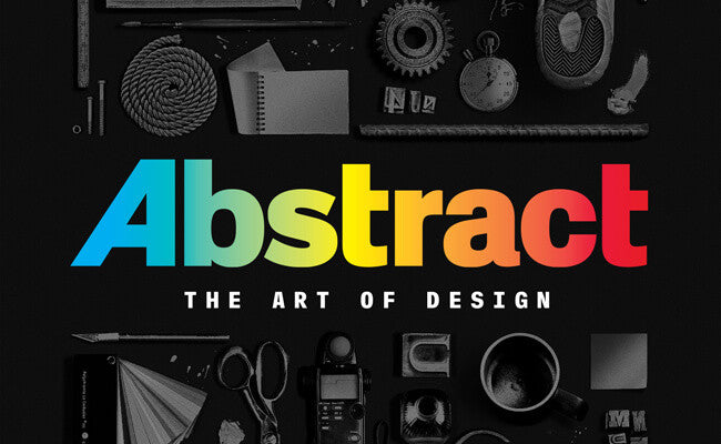
Earlier this month, Netflix released a new series documenting influential artists and designers in various disciplines, Abstract: The Art of Design. The series features eight innovative designers including Tinker Hatfield, Platon, and Paula Scher. Each artist and designer has been able to develop and master their own style and technique that allows to them to stand out and be recognizable. They have been able to become a prominent name in the art culture. It is a goal of mine to reach this point in my career, that my work is easily recognized and people are able to say, “That is a Never Made piece.”
Abstract: The Art of Design will be a reoccurring theme in my blog and this week, I’ll be discussing Abstract’s sixth episode, “Paula Scher: Graphic Design”. I had heard of the name, Paula Scher, back when I was in college. Fellow classmates of mine that would follow and study the elite, top designers in the industry, would name drop as often as possible. I was never much into name dropping, thinking if a designer is really good, then their work will speak for itself, and their name will be known without having it needed to be dropped. As that was my first experience and knowledge of Paula Scher, I was curious about her work and my classmates were raving about. Paula Scher is best known for her designs in typography and being able to develop a visual language for various iconic brands and institutions. Her work for New York’s The PUBLIC Theater and Bring in ‘da Noise, Bring in ‘da Funk were some of her work that stood out to me and was able to relate to.

The PUBLIC Theater work had a simple but distinct look. Even though it was simple in nature, it was still able to achieve its goal to unify all the various names of the theater under one name. The bold text captures your eye at first glance. It makes a firm and captivating first impression. Each letter has its own individual weight, with the “P” being the boldest. The weight of each letter decreases as the letters cascade down in size. It is techniques like this that inspires myself and my work to stand out and be bold. I am able to appreciate her work for this even though we design contrasting types of work.

Another favorite is the playbill for Bring in ‘da Noise, Bring in ‘da Funk. The cover of the playbill had a street and loud feel that is in contrast to her PUBLIC work. Each individual design and text has the simple and basic look as the PUBLIC has. However, with the joining and collection of all of them together, various text going in different directions and layout, it has a chaotic, but controlled feel. The cover truly brings the soul and heart that the show has to forefront and gives the audience a preview of what to expect from the show.
As a fellow designer, I was able to appreciate many techniques and views that she has, as I am to relate and understand many things she says, her mindset, and her various approaches in her work. That attention to detail and self-diagnosed O.C.D. that designers have are some things we have in common. As when she says that she would love to go up and down the streets and fixing all the crooked and unbalanced signs that she sees all the time is something I have fight the urge to do on a daily basis. We both strive for perfection in the details the best we can.
In future blogs, I’ll discuss some of the other episodes that I really enjoyed from this series. Thanks everyone!
Leave a comment
Comments will be approved before showing up.
Also in Blog


